
Introduction
In my previous essay, Why I use Selective Color in my Photographic Work, I mentioned a new process that I titled the Selective Color Process. This essay describes the logic behind the naming of this process.
Artists have used specific processes in their work for millennia. The reason for that is because art is about creating a unique look, a unique personal style, and specific processes are one of the most effective ways of achieving this. Specific processes offer specific capabilities which allows us to give a unique look to our work.
One such process is the Dye Transfer process. The Dye Transfer process was a printing technique that gave the photographer a high level of contrast control and access to colors that could not be created with other printing processes. It allowed photographers to control the look of the image, create subtle tones and infuse the image with the nuances required to express their personal style. Dye Transfers could only be made with specific Kodak materials. The process required that the original transparency be separated into three individual negatives, then printed onto Matrix film, to convert the original red, green and blue colors into Cyan, Magenta and Yellow. These matrices had to be soaked in organic cyan, magenta and yellow dyes then printed in registration onto color specially treated photographic paper. Doing so required a registration easel in order to keep the paper and the matrices in perfect registration while the three separations were printed in rotation. In order to transfer the dyes to the paper the matrices were firmly rolled onto the paper, one by one, with a silicone roller to allow contact transfer.
The dye transfer process never was fully accepted by the photographic community at large. It was too complex and time consuming for everyday printing. It remained a process used essentially by artists who were willing to spend the extra time necessary to make color separations and do multiple print tests in order to get a fine art print. Because the Dye Transfer process was used only by a limited number of photographers, technical knowledge and training was hard to find. Regardless of these challenges those who persevered in using it were able to create unique bodies of work. Photographers such as Elliot Porter, Charles Cramer, Ctein or Ernst Haas became known both for their photography and for their mastery of the Dye Transfer process. Unfortunately, the Dye Transfer process died in 1994 when Kodak discontinued manufacture of Dye Transfer materials.
Without going further into a technical description of the Dye Transfer process we can see that there are a number of intriguing similarities between Dye Transfer and Selective Color. Both processes aim at providing a high level of control over color. Both make it possible to create colors that are not available with other printing processes. Both require special tools, be it printing materials and darkroom equipment back then or software today. Both use dyes laid on paper as their printing medium. Both require special knowledge and training that is not widely available. Both use CMYK colors to control the tones of an RGB photograph. Both are considered somewhat ‘esoteric,’shunned by the photographic community at large, and looked upon as ‘artsy’. Both cannot continue to exist if the materials or the software are discontinued.
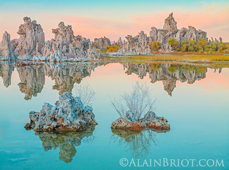 Mono Lake in Teal Colors
This photograph was created using the techniques I teach you in the new
Selective Color and HSL Mastery Workshop on USB or DVD
Selective color and the Dye Transfer process
My point is that selective Color is to digital printing what Dye Transfer was to chemical printing. However the two cannot be directly compared. Today printing consists of a set of color and contrast corrections done in Lightroom and Photoshop. For that reason it makes no sense to talk of printing techniques in terms of ink laid on paper and compare it to dyes exposed to light and chemicals. While dyes are found in inkjet printers’ ink, the chemicals used in the dye transfer process have no equivalent in Photoshop or Lightroom.
Both Selective Color and Dye Transfers make it possible to give a specific look to images, a look that cannot be achieved in any other way or with any other technique. Of course I could compare Selective Colorto other chemical processes, such Cibachrome or Lightjet prints for example. The reason I do not is because of the unique contrast and color gradation that Dye Transfer provides, generating a pastel-oriented color palette unique to the Dye Transfer process. Such is not the case with Cibachrome whose exaggerated contrast and color saturation are at the opposite spectrum of the Dye Transfer palette. However Selective Color makes it possible to create any color palette, including a soft pastel palette. It is because of these color capabilities that I compare Selective Color to the Dye Transfer process.
The Selective Color Process
While Selective Color is at the center of this process I do use other tools to create the color palette, contrast and color range I have in mind. These other tools include shadow-Highlights, Reverse Unsharp Masking (RUSM) and Curves, essentially. They are complementary controls that give richness to the images and expand the range of possibilities of the Selective Colorprocess.
Because multiple tools are used it is logical to call what I do a process. Because this process is centered around Selective Color it makes sense to call it The Selective Color Process.
Only time will tell if this comparison is valid and has lasting power or whether it is short lived and inaccurate. However, the fact remains that comparing a chemical process to a digital process on the basis of using specific inks and papers as the differentiating factor is ineffective. What made the Dye Transferprocess unique was the color separations that were made prior to printing the image. With digital processing we have no way of physically creating color separations. The only way we can come close to separating colors is through the use of software, by creating a digital file modified in regards to color and contrast. How the color and contrast of the image are modified, to what end and with what results, as well as the color quality, in technical and aesthetic terms, of this modification, is what needs to be looked at.
I believe that the Selective Color process results in digital color separations and provides the highest level of artistic and technical control to the artist. The word separation here refers to the way a color is described to the printer and not to a sheet of plastic film that will be exposed to the light of an enlarger. This difference is inevitable because we are talking about two entirely different processes, one chemical and the other digital, and in order to compare them effectively we must have an open mind and use ‘mental gymnastics’ to compare two things that are fundamentally different. And yet the goal of these two processes, their purpose, is essentially similar and that is to provide the artist with the highest level of control using a process whose purpose is to create a unique set of tonalities.
The Selective Color Mastery Workshop on USB or DVD
The Selective Color Mastery Workshop on DVD or USB is now available at this link. Go there now to download the entire table of contents, read a detailed description of this new Mastery Workshop and see samples of the audio, video and PDF files featured on this new Mastery Workshop.
If you have questions about this essay, the Selective Color Mastery Workshop or other subject of interest just email me at alain@beautiful-landscape.com
Alain Briot
Arizona
2020